TL; DR:

Critique and review are different. 🗣️Critique is simply about making the work better. Review is about assessing readiness for the next stage in the process.

Healthy critique requirespsychological safety✨. To make the work better means being able to discuss it openly, and frankly, warts and all. To do so in a constructive fashion requires that everyone involved know there will be no retribution for their work or commentary, as long as it’s offered in good faith, and in the interest of learning and doing better.

Perhaps the biggest barrier to conducting critique is 🧱structural: ‘making space’ for critique by finding time, getting the right people in the room, and ensuring that the time is well-spent. When done ad hoc, the effort necessary feels greater than the reward. So, make it an ✅operational priority, something that just happens as part of the flow of work. 

This post is longer than usual, so here’s a Table of Contents to help you navigate:

Why critique matters

Critique is essential for UX/design practice. Like, literally: it’s at the essence of design.

“The practice of design is creation and criticism in dialogue with one another. And I think we’ve emphasized creation and completely lost the sense of criticism.”
Erika Hall, Finding Our Way  

If you’re UX/Design org wants to deliver high quality work, constructive critique practice is crucial.

I am moved to write this post because in my work across literally dozens of design organizations around the world, all have struggled handling critique effectively. Either…

  • They don’t conduct critique
  • They conduct critique, but rarely
  • They conduct what they call critique, but it’s actually review

Wait? There’s a difference between “critique” and “review”? Most definitely.

Critique is about making the work better.

Review is about assessing readiness for the next stage in the process.

What are the barriers to critique?

There exists an array of reasons why UX/Design teams either don’t critique, or do so rarely.

Understanding barriers

Don’t know what critique is. Many practitioners just don’t know what critique is. They didn’t experience it in school (perhaps, like me, they didn’t study design), and they haven’t experienced it in prior work. Some of those folks may now be team leaders, and critique just isn’t part of their practice or even vocabulary. 

Confuse review for critique. These are teams that perform an activity they call ‘critique,’ but it’s actually review. Critique is simply about getting a group of people together to help someone improve their work. It shouldn’t be considered a stage-gate in a process, or an opportunity for senior people to unload on the less experienced people in the room. 

Too often, what’s called ‘critique’ is more a form of review, not about improving the work, but APproving the work, determining if it’s ‘ready’ to move on to whatever the next stage of the process is.

Some signs that you are in a review, not a critique, include:

  • non-UX/Design people in the room
  • Very senior UX/Design people in the room, whose contribution is to pass judgment on the work, and may be seen as the final decision-makers in the room
  • all the work shown is expected to have a high degree of polish/finish

 The wrong people in the room. Defining “wrong people” can go a lot of directions:

  • there are too many people (and thus too many voices, and it’s noise)
  • there are too few people (and thus too few voices, and the feedback feels like direction, or not critique, more just an informal ‘uhh, what do you think of this?’)
  • there are non UX/Design folks in the room (critique, in making the work better, should be limited to those with real expertise in how the work gets done, not just anyone with an opinion)
  • there are people who don’t know the material under discussion (if you have to spend an inordinate amount of time bringing people up to speed so they can provide helpful questions and commentary, they might not be the right people to have in the room)

Focus on the wrong things. Critique should be about making the work better, which in turn should be all about the impact that this work will have. What are the goals, objectives, metrics, etc., that this design is meant to have. Ideally, what changes when it is ultimately released? Any other discussion is a distraction. 

Mindset barriers

People may very well understand critique, and even wish to conduct it, but are wary of doing so, because of sensitivities around criticism, and how it is given, and how it’s received. Though understandable, such sensitivities hamstring critique.

Lack of psychological safety. If you remember one thing from this article, it’s that critique is about making it better, review is about assessing readiness. If you remember a second thing, it’s that healthy critique requires psychological safety. Psychological safety is the condition where people can try stuff, make mistakes, wander down blind alleys, push back, and, as long as it’s done with respect and in the interest of making the work better, those people have no fear of retribution. 

Often, teams don’t conduct critique, since people are unwilling to ‘show their mess’ (work in progress), because they fear that showing anything that isn’t ready will expose them to undue criticism, performance issues, etc. Critique has to be a truly ‘safe space,’ or it will be rendered performative.

Uneven power dynamics. Too often, critiques are used as opportunities for senior team members to tear into the work of junior team members. Some even think this is the point, in ‘steel sharpens steel’ kind of way. But if there is not a healthy dynamic, criticism from senior people can just come across as attack, the junior people experience a kind of workplace trauma, and subsequently do anything to avoid being put in that situation. This is all exacerbated if the senior people never have their work subject to critique, so it only ever goes one way.

Trouble distinguishing the work and the person. Critique is about the work. But if it’s not handled well, it can feel like it’s about the person. Sometimes this is about the nature of the feedback given, “You should…” or “Why didn’t you…?” Sometimes its because the presenter only provides one solution or idea, and so if that idea doesn’t fly, it feels personal. If the presenter provides options or alternatives, then it’s more straightforward to make it about the work. 

Discomfort with the word ‘criticism’. I’m hesitant to bring this up, but for decades now, I’ve heard people take issue with the word “critique” or “criticism,” with the idea that it encourages negativity.  

Operational barriers

Because it occurs outside the flow of typical product development practices, critique can feel like a ‘nice-to-have,’ and nice-to-have’s rarely happen, because people already feel overburdened with their ‘must-do’s. If critique is seen to add effort (and with little direct benefit), it won’t get done.

Finding the right time with the right people. In my experience, this is probably the most acute barrier to conducting critique. When done in an ad hoc fashion, it requires scheduling well in advance in order to get on people’s calendars. And when competing with other demands on time, often loses to work that feels more crucial. 

Setting the context so that the critique can be useful. I’ve supported teams where a third of the critique time is taken up ensuring people have enough context so that they can provide helpful feedback. 

A Plan for Critique

To address these barriers, I’ve created a plan for setting up critique within a design organization. And this is very much a plan not the plan—what works in your org will likely be different. I’m hopeful that the principles and frameworks give you a place to start to make it work for you. 

Principles / requirements for critique

Psychological safety. Stated above, worth restating. It must be made explicit that critique is not an environment for personal judgment, retribution, performance, etc.

All participants must be up for being critiqued (no commentator-only roles). This begs the question, “But what about more senior leaders, Directors and VPs?” And the answer is: they’re welcome to attend critiques as silent observers (in fact, it’s encouraged), but they do not get any say in the critique, unless they put their work up for critique. And remember: any work can be critiqued. It doesn’t need to be design effort. Christina Goldschmidt, VP Design at Warner Music Group, shared on Finding Our Way how she embraces her work being critiqued: “[it may be a] strategy on something or it might be a flow on something or something like that. Or it might be an approach to something, but so that they can actually give me input.”

Fits within people’s working schedule. Critiques should not be ad hoc, but have regularly scheduled time dedicated to them, so people can plan accordingly. 

Manageable. There’s a bit of a Goldilocks-ness to critique—the subject matter should be ‘just right,’ to allow for a critique that isn’t too long, too short, too complex, too basic. It may take a few cycles to figure out just-right-ness.  

Prepared. Anyone presenting their work must be prepared. Critique is a gift to the practitioner, an opportunity to make their work better thanks to the attention and feedback from their peers. Respect those peers by being prepared, so that you can make the most of your time together.  

Good critique requires stable structure

At the core of critique are two structural elements:

  • Regular critique pods
  • Regular critique hours

Regular Critique Pods

A challenge for critique is the amount of context necessary in order to get quality feedback. I’ve seen orgs where critique happened across all design, and where a third of the time spent was just getting everyone enough context to understand the design problem.

To address this, consider creating Critique pods of 4-5 people. You likely already have people already grouped in some kind of fashion (reporting to the same manager; working on the same product), so just use that. If you don’t, well,  just figure out what works for now, and they’ll likely shift and evolve for a while. 

Regular Critique Hours

Another challenge for establishing critique is simply to find the time to do it. It’s important that critique happen frequently enough that it doesn’t feel like a big deal, but just part of the process.

To address this, consider setting aside 2 hours a week for critique, at the same time each week (e.g., 4pm-6pm UK Time every Wednesday). Everyone blocks this time off in their calendar and knows it is when critique happens.  

This time block holds across all critique pods. Benefits of having critiques happen at the same time includes:

  • Two pods, working on adjacent or related material, can have a co-critique
  • The VP, Directors, and others who aren’t part of specific pods know when they can join specific critiques, which is great for leadership visibility (though: if leadership is not putting themselves up for critique, then they are to be silent observers of the process)

What to Critique?

There’s some question as to what is useful for critique. This illustration from the book Discussing Design depicts the ‘sweet spot’ for critique:

Diagram showing "The Life of a Design" with a left-to-right time line, starting with "The first spark of an idea" then "you understand enough of the idea to communicate it to others" which begins 'the critique sweet spot,' which ends at 'time to product the ideas as is and move forward, and then the timeline completes with 'the final, produced product.
 

Critique shouldn’t only be about detailed designs. Workflows, wireframes, content directions, etc., are all good subjects for critique, as all are designed to deliver on some objective. 

Conducting Critique

Every critique session should have at least 2, and as many as 4, critiques within it. Rotate through the pod to make sure everyone is getting critiqued every couple weeks. 

Each critique takes 30 to 60 minutes, depending on how much material there is to cover. 

Discussing Design provides this simple framework for approaching critique:

What is the objective of the design? What elements of the design are related to the objective? Are those elements effective in achieving the objective? Why or why not?

Before Critique

The Practitioner should spend ~30 minutes before the critique to set it up. They should create a board (in Figma/Figjam or Miro) with the material they want to walk through, have prepared a statement about the objective(s) they are trying to achieve, and prepare any other context necessary to bring people up to speed (the business problem, the user type or specific target persona).

Early / Mid / Late

When preparing for critique, it’s important to situate the design work in the overall story of the project. If Early in the project, direct people away from the details of the solution, and more toward the matters of structure, flow, shape, message. If in the Middle of the project, have people critique in detail. If Late in the project, discourage commentary about structure and flow in favor of final fit and finish, adhering to standards, and the specific use of language. 

The Critique (figuring about an hour total, but will vary depending on breadth and depth)

Presenting – 10-15 minutes

After folks have gathered, the Practitioner presents their work, starting with the Objective statement and any other context. Then they go through the designs, articulating why they made key decisions. 

Clarifying questions – 5 minutes

Once the design has been presented, the Critiquers ask any clarifying questions they have, to make sure they understand exactly what is being addressed by the designs.

Writing down feedback – 10 minutes

On the critique board, Critiquers write virtual stickies to capture their thoughts about the work, in context. The feedback should be rooted in a) the objective and b) design standards. The amount of time for writing down should be relative to the amount of work shown, but it is important that it is timeboxed.

Feedback should be both positive and negative. It’s okay for the feedback to be mostly negative (we are trying to improve the work), but it’s helpful to call out what is working (and should be left as is).

When a Critiquer places their thought, if another Critiquer agrees or disagrees with it, place a 👍 or a 👎 on the sticky to indicate that. 

As Critiquers are placing their thoughts, the Practitioner is reviewing them, and making their own notes in terms of follow up questions to ask. 

It’s essential that this first round of feedback is done silently. If you go immediately to oral feedback, that preferences folks who are more comfortable speaking out, who ‘think out loud.’ Reflective written feedback enables greater participation from Critiquers. 

For strong guidance in how to give good written feedback, read: Asynchronous Design Critique: Giving Feedback. The advice holds even for synchronous, written feedback.

Feedback Don’ts
  • Do not provide “preference” based feedback (“I like…”)
  • Do not offer solutions in the feedback (“Move this to the right”)
  • Make assumptions—if you’re not sure about something, ask a clarifying question
Feedback Do’s
  • Connect comments to objectives or design standards
  • Bring a perspective (either yours, or a persona’s)
  • Point out (what seems to be) the obvious—it may not be so to others
  • Indicate your level of severity. For example, the emoji model suggested by the Giving Feedback article:
    • 🟥  a red square means that it’s something potentially worth blocking
    • 🔶  a yellow diamond is something where one can be convinced otherwise, but it seems to that it should be changed
    • 🟢  a green circle is a positive confirmation.
    • 🌀 a blue spiral is for either something that uncertain, an exploration, an open alternative, or just a note.
Discussing feedback – 15-20 minutes

The Practitioner walks back through the work, and the critique comments. They ask for clarification on anything that they don’t understand. For any sticky with an 👎, ask the person who disagreed to explain why. 

The Practitioner should not defend their work, nor revise/refine based on feedback in the moment. All the Practitioner needs to do is take the feedback in, and make sure they understand it. 

To understand the ‘weight’ behind the feedback, conduct a ~3-minute voting session, where the Critiquers can vote on the (3-5, depending on the amount of commentary) items that they feel most strongly need to be addressed. This helps the designer understand where to focus their efforts in revision. 

Additional Resources

Web searching will turn up a bunch of good stuff on how to conduct critique. Here are a few resources to get you started. 

A few years ago, we interviewed Jen Cardello for Finding Our Way, and she shared that her team (UX Research) is peered with “market research, behavioral economics, brand, and advertising research, and customer loyalty” in an independent Insights team. The idea was for research to avoid a functional bias, so that it couldn’t be “weaponized” by marketing or design.  

Diagram showing UX Research, Market Research, Analytics and Data, Customer Care/Support as part of a Holistic Insights organization

And while UX Research is still typically found within a UX/Design organization, I’m witnessing a nascent trend of it being located elsewhere. For example, Nalini Kotamraju, SVP of Research and Insights at Salesforce, shared in a discussion on making research leadership more effective, that her team has “moved out of UX,” to be part of a broader product function. 

At the heart of this is a recognition that siloed research leads to a fractured understanding of the people the business is serving and territoriality around the idea of ‘who owns the customer,’ and that to be its most effective, research needs to engage in the entire end-to-end service experience, and that journey spans many organizational functions. 

And in my work, I’ve started recommending to my clients that they consider the creation of these holistic insights teams, using the simple diagram at the right to show how what are typically seen as distinct practices are actually puzzle pieces fitting together as a whole.  

Proceed with some caution

While an independent, holistic, and robust Insights org is the best mechanism for rich customer and user understanding, there are preconditions required in order for it to succeed.

A move towards an integrated Insights organization will likely be a journey, and must be taken with care. What’s crucial is that for the ‘containing’ function for UX Research to be a strong advocate and capable steward. If UX Research is moved out of UX/Design and into Marketing (to be partnered with Market Research), that could prove detrimental if Marketing leadership favors quantitative insights, or doesn’t understand the value of generative methods. In such a case, it would be better for UX Research to remain in UX/Design, where, even if its purview is limited, it can engage in a fuller practice.

Perhaps the greatest risk for a separate Insights group is to be seen as a disconnected internal consultant, dismissable by folks in Marketing or Product who feel that Insights isn’t aware of the real challenges on the ground, or simply ostracized because of some internal “us vs them” mentality. (I’ve talked about this as a challenge for strategic design.)

So, in order for this to work, your company must be a true ‘learning organization.’ In our discussion, Jen shared that Fidelity “is so obsessed with learning. We actually have learning days. Every Tuesday is a learning day.” Instead of worrying about being ignored or neglected, Insights has the opposite (and good) problem of being in too much demand. 

Another factor for any organization design is professional development. The ‘containing’ organization needs to be one that those practitioners aspire to lead. When UX Research is embedded within UX/Design, that implies that the career path for those UX Researchers is to become UX/Design Leaders. Is that true? Or are they better suited to becoming “Insights” or “Strategy” leaders? (The same holds for other functions like Accessibility. While many Accessibility teams start within UX/Design, those Accessibility practitioners typically don’t see their career heading toward UX/Design leadership, which suggests they belong somewhere else in the organization).  

How is your Research org organized? 

9 years ago, we started the process of writing Org Design for Design Orgs because there was burgeoning demand for making sense of the UX/Design function within companies. It now feels as if (UX/Market/Etc.) Research is in a similar moment. Who’s writing Org Design for Research Orgs? 

That Vision Thing

About a year ago, I distilled the conversations Jesse and I had been having with design executives on our podcast Finding Our Way into a post titled, “Design leadership is change management.” And the first element needed to drive change? Vision, which I defined as “an orientation, pointing the team in the right direction. Even better, it’s a destination to which people are being led.”

Over this past year, in working with design leaders who have found articulating a vision to be challenging, I’ve put more shape around my thinking, and found myself repeatedly returning to an example, which I thought I’d share here.

Vision or Agenda?

Before getting to the example, a quick nomenclature check.

I think a stumbling block for design leaders when it comes to “vision” is that “vision” often means something very specific in design: a north-star-style depiction of a future state experience. But the change that a design leader seeks can incorporate so much more—it could involve new ways of working (double diamond; embracing product discovery), or the desired impact on the business and their customers. So instead of “vision,” I advocate for the word “agenda.” It doesn’t have the baggage of “vision,” and it also makes clear that, as a leader, it’s incumbent that you have a (dare I say) political point of view, a cause for which you’re advocating.

An Example of an Agenda

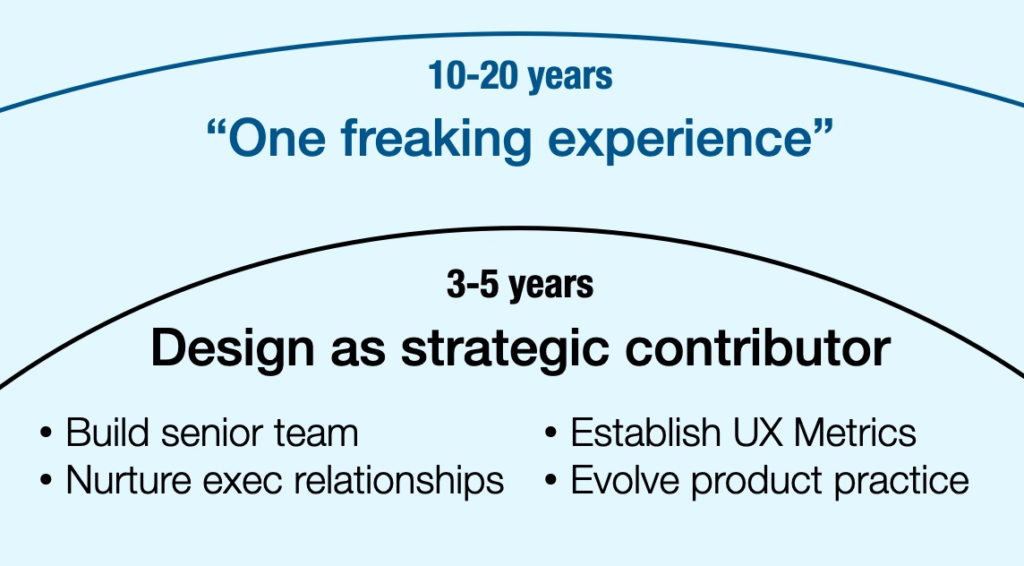
Among the design executives Jesse and I interviewed was Kaaren Hanson, Chief Design Officer of Chase Bank. Early in our discussion, when defining her role, she identified four initiatives: building a senior team, nurturing executive relationships, establishing UX metrics, and evolving product development processes. Later in our discussion, which sharing how she would align the efforts of her 800+-person team, she emphasized how they’re all creating “one freaking experience.”

As I sought to put shape on the ideas of agenda and vision, I realized I could use what Kaaren shared. In a company as complex as Chase Bank, achieving “one freaking experience” could take 10, even 20 years (because it requires not just internal alignment, but may need regulatory change as well). It makes for a powerful long-term agenda (and, in this case, is also a vision). The four initiatives she outlined could be grouped in a near-term agenda of “Design as strategic contributor,” a 3-5 year program (my estimate) that, by establishing Design as a credible business partner, sets the company on the course of delivering on “one freaking experience.”      

Diagram showing one horizon-line curve, underneath reads 10-20 years, underneath that reads "One Freaking Experience". Then another horizon line curve, underneath that reads "3-5 years", underneath that reads "Design as strategic contributor" and then four bullet points beneath: Build senior team Nurture exec relationships Establish UX Metrics Evolve product practice

Take the time to do this for yourself

As I write this, it’s the start of the new year. A worthwhile activity for any design leader would be to sit down, even for just 30 minutes or so, and write down their agenda. Have both a long-term agenda (though 10-20 years is probably excessive for most folks) and a nearer-term one that ladders up to it. This agenda may be something you share with your team (to drive alignment) or it may be personal (perhaps about your career goals). Making this concrete will enable you to make better decisions throughout the year, as you’ll have a clear organizing principle to go by. 

Thesis

Design maturity models are oversimplified frameworks that mask the necessary nuance to understand and develop an organization’s ability to get the most out of a Design function. That said, used responsibly, they can be a helpful heuristic, particularly early on, for orienting yourself in an organization. 

The futility of maturity models

Hang Xu has identified design maturity as a frame for better understanding the challenges the UX/Design community has been expressing. As a recruiter, he’s attuned to the impact of an organization’s maturity on a practitioner’s ability to succeed. He’s been writing a bunch on LinkedIn on this subject, including this recent post on probing and assessing an organization’s maturity. In direct communications with me, he’s asked for my take on the subject, and, as I see the concept of maturity come up more and more often in my work with design leaders, I figured I’d publish my thoughts. 

When we were writing Org Design for Design Orgs, I researched UX/Design Maturity models, as I thought they’d be helpful for grounding our discussion. What I found then (and still, largely, see now) is that these maturity models are too simplistic, reducing a bunch of factors into a single-number linear framework. Through my experience, I knew that a single organization may be at multiple places along the maturity line, which suggested that it wasn’t a useful tool for diagnosis.

My frustration proved fruitful, as it lead to writing chapter 3: The 12 Qualities of Effective Design Organizations, which is probably the single best chapter in the book. Instead of a single overarching maturity model, I believe it better to rate a set of qualities independent of one another, coming up with a kind of ‘report card’ for the organization. This specificity and nuance allows people to zero in on specific issues worth addressing. 

Erika Hall shared with me (in a direct message) her frustration with UX/Design maturity models as being “nonsense because they’re overly simplistic, linear, and…absolutely ignores the business model.” She then expanded on this on LinkedIn:  

Step 0 of “design maturity” is aligning the fundamental business model with the wellbeing of *all* users of and stakeholders affected by the systems being designed. This includes workers, communities, and ecosystems.
Otherwise, it’s just increasing levels of acontextual organizational proficiency in candy-coating extraction and exploitation. And then, what’s the point?

The utility of maturity models

So, if maturity models are so dumb, why do they persist, and why can’t even I shut up about them? In my work with design leaders, I’ve found that there is some value in the abstract concept of maturity as a guide for how to engage with their organization. This came up in the most recent episode if Finding Our Way, where Jesse and I circled the subject, and I reflected on Jehad’s comment that some design leaders shouldn’t go to the lengths of trying to ‘demonstrate impact,’ because the company might not be ready for that, but to instead to tune your message to the company’s maturity, which may involve a different means of ‘showing your worth.’ I then dug into this thinking on the intersection of UX Metrics and Maturity.

Jesse, in his work with his coaching clients, has developed a framing of ‘three trajectories’: organizational maturity, design maturity, and leadership, and how navigating the intersection of these trajectories is crucial for any leader wanting to operate at their fullest potential. (It’s worth reading his post, so go there and do that now.)

(Welcome back.) 

As long as you don’t take a maturity model to be prescriptive, but instead a tool for initial orientation, they can be a useful heuristic. If you have to use one the Nielsen Norman Group one is probably best, and appears to have become the standard. Interestingly, if you strip away oversimplified linearity, and look at the constituent factors (Strategy, Culture, Process, Outcomes), it’s even more useful, as it affords some nuance, akin to the 12 Qualities.  

UX/Design leaders often get caught up in their personal missions, their narratives of change and impact, and believe they just need to “educate”, “persuade,” “evangelize” their point of view, typically one of customer-centricity and the importance of quality, in order to influence those around them. This proves ironic, as these UX/Designers who espouse ‘outside-in’ when it comes to delivering customer experiences, now practice “inside-out” when trying to get what they want.

In my work with leaders, I counsel them to “connect the work of UX/Design to what the Business values,” and to meet their leaders where they are on their maturity curve. This means listening to them and their concerns and responding to that, not foisting your desires upon them. 

This came to mind as I read Janice Fraser and Jason Fraser’s recent book, Farther, Faster, and Far Less Drama, a practical guidebook to lower-stress leadership. It features a sidebar from Hannah Jones, now the CEO of the Earthshot Prize, and formerly Nike’s first Chief Sustainability Officer (a role she had for 16 years). She shares how she practiced change, and features this bit of wisdom:

The advice I would give people undertaking to change an organization is to understand motivation… Motivation is at the root of most human behavior—and most people are pretty entrenched in what their motivations are…If…you’re not critical or judgmental of them, then you can start to meet people where they are and bring them with as you allies.”

She then shares what that meant practically:

“So sustainability as ‘hug a tree’ wasn’t getting us anywhere. But once we framed it as a risk mitigation effort for the board, a financial benefit to the CFO, and a growth opportunity to the innovator and the CEO, we could start to pull levers with far greater power than when I had remained entrenched in my own language…

“…Know your place in the system, but know other people’s places and benefits and why they…[are] doing what they do. Then figure out how to make their worlds feel better to them. ‘Make everybody else the hero in the story” was one of my mantras.”  

This resonated with something I posted a while back, how Billie Jean King got women paid the same as men for professional tennis, the heart of which was: “Just understand their side, so when you sit down to speak, and have dialogue, you actually have some understanding and empathy for them. And, if you can show that, I think they’ll start to think about you in a different way as well.”

In my experience, UX/Design types do more to constrain their ability to make an impact than anyone else. Rein in that missionary zeal in favor of making a connection. This doesn’t mean you shouldn’t have an idealistic agenda, but don’t assume what motivates you motivates others. Does this mean you’re playing politics? Yep. That’s the job.

Since I’ve become independent, perhaps the most common request of my time is helping companies develop good career frameworks for their UX teams. There are many reasons why they want them:

  • Provide clear professional growth paths
  • Smarter recruiting and hiring practices
  • Less biased performance management
  • Better alignment with other functions (e.g., product management, engineering)

In creating these frameworks, I resist linear “career ladders,” in favor of “trellis,” as my experience with people in UX is that they seek a bushier, less-directed growth, and these frameworks need to be flexible to handle the range of practices (design, research, and content) within UX. 

I have created a masterclass out of my approach to building these, and will be teaching it at the Design Ops Summit on October 5-6, 2023. You can register for the whole conference or just my class. Either way, use code MERHOLZ-DOS2023 to receive a discount. 

The Building Blocks of a Flexible Career Architecture

To create a robust architecture requires a set of components that interact with and build on one another. 

Capabilities

The skills, behaviors, mindsets, etc needed to do the work:

– Craft skills

– Strategic mindset and tools

– Professional abilities

Practices

Within any function is a set of Practices.

For UX, that’s typically UX Design, UX Research, and Content Design. 

Levels

An org-wide Leveling Framework structures a set of expectations for experience, autonomy, and scope at each career level, and across Manager and IC tracks. 

Roles

Specific roles are found at the intersection of Levels and Practices, with suitability and readiness made clear by competency in skills.

In the masterclass, we dig into each component.

Capabilities

We start with Capabilities as they are the ‘atom’ in a career framework. What are the skills, mindset, and abilities at the heart of the work? Through our activities, we’ll land on a Capabilities Taxonomy, which may look something like:

Craft

MAIN

Interaction Design
Visual/UI Design
UX Writing
Information Architecture
Planning Research
Conducting Research
Analysis & Insights

EXTENDED

Accessibility Guidelines
Inclusive Design
Service Design
Prototyping

Strategy

Experience Strategy
Technical Literacy
Business Savvy

Professional

Communication and Presentation
Collaboration and Facilitation
Structuring and Planning Work
Domain Knowledge
Navigating the Organization

Practices

The practices in an organization are an amalgam of craft capabilities. In the class, we’ll help you identify your distinct practices. In the UX organizations I’ve been supporting, it usually shakes out to something like: 

Practice Product Design UX Research Content Design
Core skills Interaction Design
Visual / UI Design
Framing Research
Conducting Research
Insights and Analysis
UX Writing
Information Architecture
Description Conceptualize, structure, and detail our offerings within the context of a broader user journey. Conduct research to identify the wants, needs and abilities of customers and end-users, translate those insights into recommendations from strategy to detailed design. Shape experiences using content and language to build user confidence. Plan, create, and structure product content.
Core activities Understand needs and behaviors; develop insights; diagram flows; design wireframes and prototypes; test solutions Develop hypotheses; identify methodology; plan research; conduct research; analyze data; synthesize findings; present insights; provide recommendations Explore voice and tone; Plan content governance; define standards for content types; develop end-to-end content strategy; draft content for end-to-end product experience; review content

Levels

Many career architectures start with Levels, but it’s only after Capabilities have been determined can you build a Levels framework, because how someone advances in their career is contingent on the development of their capabilities.

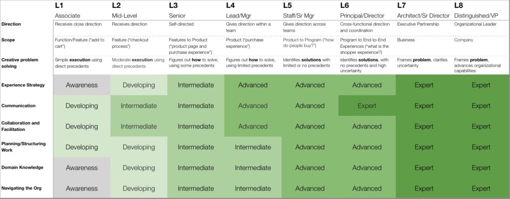
Years ago, I published the levels I created for the Snagajob Design team, and it has since become a starting point for many UX orgs. My thinking has evolved since then, and I prefer to start with a simpler overview of Levels, to then save the complexity for when folks are ready to dig into the details:

Detailed table of a levels framework.

In the masterclass, we dig into these specifics, as well as how levels differ for people on a Management or Individual Contributor track. 

Roles

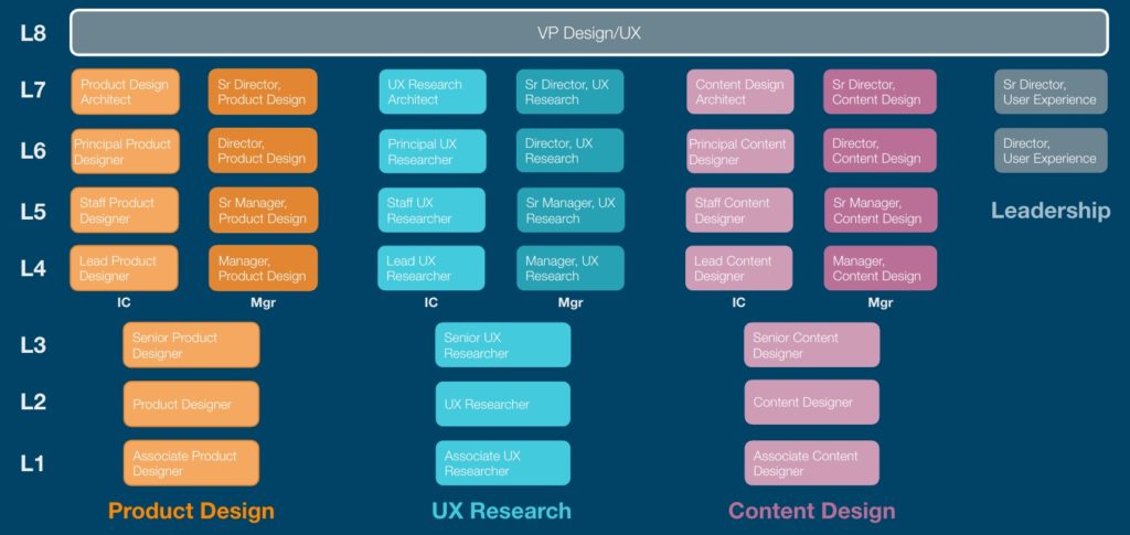
Where we end up is a set of distinct roles that make up the UX organization. I find it helpful to visualize the org with each role shown:

This visualization makes clear the main paths through the organization. 

But wait, there’s more

What I’ve shared covers the core of the masterclass, but there’s a bunch more we address, including detailed rubrics for each Capability, the variety of ways people can grow in a Practice, how team members can use the tool to chart their career growth, how to roll out a new career architecture, and the difference between Professional Development, Performance Management, and Promotion.

If you’re reading this before October 5, 2023, you can sign up for my masterclass at the Design Ops Summit. If you’re reading this afterward and are interested in this material, don’t hesitate to reach out to me. 

A common challenge for the design leaders I support is identifying metrics. They know their team is having a positive impact, but struggle articulating it in any concrete way. They seek canonical, industry-standard metrics that prove UX/Design’s value, but the reality is, no such metrics exist. The nature of UX/Design’s impact is specific to the company, the audience, and the problem space under question. 

I have found that, to have productive metrics discussions, it’s crucial to appreciate organizational maturity. For example, it’s hard to have a meaningful discussion of how UX/Design effects business outcomes if the company doesn’t have a model of Customer Lifetime Value (CLTV) that maps customer behaviors and actions to a probability of financial return.

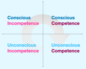
And when I think of maturity, I find myself returning to the four stages of competency model (shown below), which can be used as a generic maturity model in a wide array of contexts. 

Diagram illustrating the progression from Unconscious Incompetence to Conscious Incompetence to Conscious Competence to Unconscious Competence

At the initial stage of Unconscious Incompetence, the organization is deeply immature, not knowing what it doesn’t know. No one I work with is at this level, because working with me presupposes some kind of ‘conscious’ness.

The design leaders I work with seek to establish Conscious Competence, usually in the form of robust UX metrics that connect to impact, but often find themselves in Incompetent organizations that aren’t ready to make those connections.

In fact, in a Conscious Incompetent organization, UX metrics may be seen as self-interested or vain, that the UX/Design team going off doing their thing, potentially eroding trust with colleagues. 

Instead, you need to meet the organization where it’s at, which might mean ‘dumbing down’ how you gauge success. In a Design-immature organization, where you’re just trying to get a footing, the opinion your more established partners (e.g., product management, engineering) have of you may be how you show your worth.

Or, it’s likely that your organization has some rudimentary understanding of experience (e.g., anecdotes from customer care; NPS), and so you begin there, taking the language that already exists, demonstrating your concern for those areas. Over time, as you build credibility, you will then be able to introduce more mature UX/Design metrics that you know are better indicators of value.

But proving the UX/Design organization’s value, even if sophisticated, is a sign that you have not yet reached full maturity. 

The 4 Stages model shows that at the highest level of maturity, the UX/Design organization no longer needs metrics that prove its worth. It’s simply understood (“unconsciously”) throughout the company that UX/Design is worth doing. This was highlighted for me in the Finding Our Way conversation with Daniela Jorge, Chief Design Officer at PayPal, when she shared, “We don’t have hard metrics that I own from an experience standpoint, but we define those per project, right? So if we have a specific project that’s around helping customers achieve a specific goal, those are defined at the initiative level.” At PayPal, they recognize that its ultimately foolish to assign impact metrics to a function, because impact is realized through cross-functional work.

But for the Design team to get there, I’m guessing (we didn’t ask), that they did have to go through these stages of proving their worth, enabling the executive leadership team’s unconscious confidence in design’s value.

Over the holiday break, I reviewed the 5 conversations that Jesse and I have conducted with truly senior design executives for our podcast Finding Our Way, looking for lessons that could be distilled and imparted for those who aspire to such roles. As I pored over the transcripts, an overarching theme emerged:
Design leadership is change management

This was actually stated in the first interview, by Katrina Alcorn, GM of Design for IBM:

“Well, I think if design was fully understood and recognized and invested in and respected, the way, for example, development is, we would not need to be change agents. We would need to be good stewards… I think we’re change agents because all of us doing this are still part of a movement to change how businesses work, how they run.”

In my thought partnership work with design leaders, I’ve at times encouraged ‘change management’ tactics to help them with specific initiatives. What reviewing these discussions with successful leaders made clear is that change management isn’t a tactic—it’s the job. And that other leaders would realize greater success if they framed their efforts with this perspective.

Thankfully, these leaders also shared the mechanisms by which they’ve enacted change. Analyzing these discussions, I distilled a set of practices and a mindsets that should help anyone trying to establish design as an active participant within their organizations. While I won’t claim this as some kind of magic key to unlock success, I would encourage using it as a playbook that scaffolds your efforts.

A. Shape a vision

B. Adopt a portfolio approach

C. Manage the relationships

D. Communicate with intent

E. Maintain patience and perspective

A. Shape a vision

To lead requires vision. At minimum it’s an orientation, pointing the team in the right direction. Even better, it’s a destination to which people are being led. Visions come in many forms. They could be mindset shifts (becoming more “customer-centered” or “experience-led”), process evolution (adopting dual-track agile, user-centered and inclusive design methods), or outcomes that show impact (adopting metrics like Google’s HEART framework).

North Stars

And, being designers, a common type of vision is the North Star, a concrete depiction of an improved future-state offering. As Greg Petroff stated, “You use a north star to drive the art of the possible…, to scratch the itch on tough questions… Artifacts are … tangible and easier for people to…identify with.” For Daniela Jorge, North Stars “make it feel real so that everyone can get aligned around that same outcome and that same end state.” The thing to keep in mind (and communicate to others) is that North Stars are not execution plans, and, as Greg says, should be done “in a way where people have permission to break them and change them, and challenge them.”

B. Adopt a portfolio approach

For Design organizations, there will always be more work to do than people to do it. So the trick is to figure out how best to focus efforts. 

Kaaren Hanson cautioned against trying to do All The Things at once. “If you come in and you say, ‘We’re just going to do everything, we’re going to slow everything down,’ you are going to fail. But you can…look at this portfolio of initiatives, and say, ‘These two seem ripe for really having a bigger impact… And so we’re gonna put our points here’… and hope like hell at least one of them works.” 

Or, as Katrina Alcorn said, “If you say yes to everything, nothing gets done.”

But then, how do you assemble this portfolio?

Choosing who you work with

When Greg Petroff was building the Design capability at GE, in order to focus their limited capacity on that which would have impact, his org would only work with two kinds of teams: “either they totally got us and they totally understood design, and they were all in, or they had tried everything and were failing and the business was about to die…And if you’re in the middle, we didn’t have the time for you. We were sorry.” The logic being, “if we could take a business that was struggling and make it successful, that had currency in that culture… And then the net promoters, …they were the ones who, if things were kind of tough, they could kind of support us in a moment.”

Rachel Kobetz had a similar approach: “It was a mix of finding … those people that could be champions with me, those people that could be the beacons. It’s really important to find, not just the individuals, but the projects or programs that can be the beacons to showcase how a new way of working yields better outcomes.” 

Short-term gains within a long-term frame

Key to change management success is showing progress early. As Greg Petroff shared, “Senior executive attention span can be quite short. And so you have to find ways to show demonstrable quick wins and benefit, while leaving room for the things that are actually more substantive and impact-driven, that are going to take more time.” Rachel Kobetz cautioned that, “Sometimes, you know, leaders, they are charting the vision for tomorrow without delivering for today.” You need to balance, “be able to go deep, to be able to make sure that we’re building for today.” 

Operating Mechanisms

For that longer-term frame, output (like launching a new product or service, or overhauling something in sore need of improvement), even with successful outcomes (more sign-ups, happier users) is insufficient. As Kaaren Hanson stresses, “Those operating mechanisms count so damn much.” By operating mechanisms she means evolving processes to account for customer-centered concerns, such as making sure customer experience measurements are part of business reviews. It also means “working with leaders across the business, including the CEO of consumer bank or the CEO of connected commerce or the CEO of wealth management, to ensure that design is sitting at their table,” making it a default expectation that design is included in the senior-most business conversations. She continues, “you have to get into the operations of the company, and companies have like a, heartbeat, which goes back to, what are the expectations for designers? What are the expectations for product managers? How are we bonusing people on this stuff? Like, those are all the operating mechanisms you have to infiltrate.”

C. Manage the relationships

Infiltrating operations requires working the relationships necessary to make change happen. And while it’s important to develop good relationships with the people within your organization, what these leaders stressed was how crucial it was to establish relationships with your cross-functional peers in product, engineering, marketing, and with executives and other stakeholders.

Cross-functional relationships

Kaaren Hanson has staffed her leadership team such that “every design leader that sits within a line of business sits at that [line of business’] CEO table.” She also expects that her design leaders are spending more time messaging and in meetings with their “product, engingeering, and data partners” than any other people. 

And Rachel Kobetz, with whom we went quite deep on relationships, shared, “when I’m talking about the importance of the relationships, it’s where I spend a lot of my time. …Working across and working up…the whole company to make sure that there’s clear communication, there’s trust and we’re building relationships so that people understand what we’re doing.”

Make your partners successful

A recurring theme was to focus not on your own organization’s success, but, as Kaaren Hanson points out, “my job is to make you [my partner] more successful.” Greg Petroff echoed this, “you always wanna make sure that the, your partner is the one who gets the attention…We celebrated the wins, but the win was not us. The win was the business unit.”

Co-create outcomes before starting the work

A means for strengthening relationships, and to ensure your partners’ success is to co-create outcomes before doing the work. As Greg Petroff put it, “I’m all about co-defining outcomes. I think that’s a missing gap in software development. And I think a lot of product teams start without actually having a lot of clarity about what they’re trying to accomplish and they feel like the agile process will help them get there and it’s just nuts. And so you know, I am, I’m all about working with product teams early on to do things like Lean UX canvas work.”

Designers often like to talk process, but Rachel Kobetz suggests, “don’t harp on the process itself. Actually focus on the outcomes, and when you have shared outcomes together, you’re going to be set up for success.” By starting with shared outcomes, you can then engage in process discussions, because if “you’re aligned on shared outcomes, they’re going to be much more receptive and open to a new way of working, versus you just come in and say, ‘Everything you’re doing is wrong, and this is how we’re gonna do it.'”

Mixed maturity means varying reactions

One of the specific challenges of managing change, particularly in sizable organizations, is that you’ll have a different degrees of maturity in the different parts of the organization, and that leads to a range of reactions to that change. As Greg Petroff said, “it depends on the culture of the organization and it’s maturity and sometimes parts of the organization are great and others aren’t.”

Rachel Kobetz shared, “People handle change or evolution much differently. You have some people that are, like, ‘This feels awesome. I love it.’ You have other people…that say ‘change is the only thing that’s constant.’ And then you have other people that are like, ‘Wait, hold on, you moved my cheese, what happened here?'”

No judgment, maintain positivity, avoid toxicity

At the heart of change management is a recognition that things today aren’t as good as they could or should be (or why bother changing). TSo his leads to an unfortunate tendency to criticize the current state, but, as Kaaren Hanson learned, “Being judgmental is toxic…As someone who’s been in this field, we are incredibly critical of things. That’s our job is to be critical, right? But that’s not helpful when you’re working with other people, and you’re trying to drive change in an organization, because if you’re judgemental, it’s almost like you’re adding toxicity to relationship. So I’ve had to rein that way back.”

D. Communicate with intent

Every leader we spoke with addressed the importance of communications, and having a strategy, a plan. It’s not enough to do the work, it’s even not enough to make an impact. If you don’t make the effort to let others know about that impact, it might as well not have happened.

Katrina Alcorn shared how she’d been publicly blogging about the ongoing evolution of design at IBM. 

Kaaren Hanson stressed how much time she’s spent with her leaders, having them share their stories with her initially, so she can provide feedback on the most salient points to then communicate out, “they’ll have those short stories and snippets that they can share with their executives in the elevator.”

Greg Petroff has built “shadow comms teams,” writing a monthly newsletter about all the things his team was doing. Tying to the prior theme, these newsletters showcased partners, “always a story about someone else in the organization that we promoted, ‘the SVP of product does this, and here’s the decisions that they made that were great around design work,’ because you want to celebrate them, too.”

Rachel Kobetz has found that the “the essence of it is just overcommunication.” She exploits a number of channels in getting her message out, “whether that is in a conversation with another executive in a meeting, and being able to have that moment to talk about the great work that the team is doing, or that our two teams are doing together. Creating a newsletter. Doing my own writing and pushing it out across the company. Whether it’s in town halls or, showcases, quarterly events, all of the different avenues you can take, you have to use those as opportunities to get the word out.” She concludes,  you’re never done with that communication.”

Transparency

A judgment call that’s difficult for some leaders is knowing what to say to whom. As leaders, you have access to potentially sensitive information. That said, Kaaren Hanson stresses the importance of transparency: “if you’re not transparent about what you’re doing and why you’re doing it, it’s easy for people to read all kinds of other things into what you’re doing.” Daniela Jorge concurs, “something that I always aim to do as a leader, is providing as much transparency and context… I think it’s very easy when you’re in a leadership position to forget that you have access to a lot more information and context that a designer on the team might not.”

This transparency is essential for working with other functions, particularly when working toward shared outcomes. Rachel Kobetz proposes, “you instead open up that box and you create transparency in the process. You bring people in, you make them part of that process from day one, but then when you’re telling the story of it, you’re starting off on the foot of, we’re all aligned to shared outcomes.”

E. Maintain patience and perspective

As design leaders, we often have a clear view of where we want to go, and what it will take to get there, and the time it takes to make progress can prove quite frustrating. When I asked Daniela Jorge about how she helps her leaders who may be operating at a new level of seniority, she shared, “a lot of it is that we talk about perspective, patience, right? Figuring out how you’re influencing, figuring out how you can sometimes measure progress in small increments. Because the job that we do is hard, right? And especially because I think we are able to see what it should be and what it could be. And that isn’t always what is happening in that moment or in the short term. So, a lot of the time that we spend is just talking, regaining perspective so that folks don’t get discouraged.” 

So get out there, and make some change!

If I were to assess the ‘vibes’ at the outset of 2023, it’s that there is a potential for fundamental shifts in the ways that businesses are working. This provides an opportunity for Design Leaders to proactively insert themselves into those ‘operating mechanisms’ (as Kaaren Hanson put it), and make some real change. 

As this post suggests, change is hard. Its taxing, frustrating, and time consuming. But it’s also how we can make things better, for us, our teams, our colleagues, and our customers. If you’re signing up to be a design leader, you are signing up to make change.

(And if you’re interested in pursuing this theme further, I wholeheartedly recommend the new book Changemakers by Maria Giudice and Christopher Ireland. It provides clear actions you can take to realize the change you seek.)

Though the book I co-wrote is titled Org Design for Design Orgs, and, sure, it addresses broader design concerns (communication design, service design, hardware and industrial design, environmental design), it’s focused on a kind of design org, specifically digital product/UX design orgs reflecting the bulk of the experience Kristin and I have. 

As such, I’ve been surprised, and humbled, when I meet Brand Design leaders who have read the book and found it helpful in thinking about how they shape their teams. What I’ve found is that, as these teams grow, their leaders not only struggle with many of the same challenges product/UX design leaders face, their distinct organizational context leads to a whole bunch of different problems.

Yesterday, I had the honor of facilitating a public conversation titled “Org Design for Brand Design Orgs,” featuring Li-Anne Dias (Director of Brand Design at Handshake), Erin Pinkley (VP, Creative at Zendesk), and Jessica Rosenberg (Director of Brand Design at Webflow). The idea for the event came about when Li-Anne reached out to me with a lot of thoughts on applying the lessons from the book to her work, and so I connected her with Erin and Jess, both of whom I’d had the fortune of supporting in the past. Li-Anne prepared a presentation to kick things off, and I facilitated the conversation between the three of them, as well as bringing in questions from the audience. This all took place over Zoom, so we recorded it, and I have shared it on my just-launched YouTube channel:

Over these 75 minutes, we cover a lot of ground, but what we also realized is that this is a conversation that is just beginning. Each of us would love to continue the discussion, so if you’ve got ideas on where to do so, let us know!

(this post is a bit of a muddle, but addresses what I see as a crisis in our field, and so I wanted to get these ideas out there, warts and all.)

A manager has many responsibilities, but the job boils down to “getting the most out of their team.” This means working with the team to get desired outcomes (high quality, customer and business impact, positive internal relationships), and to help team members grow in their careers.

Recently, I’ve been part of conversations that illuminate a crisis in management which in turn is failing UX professionals. When Abby Covert joined Jesse and I on our podcast, she compared the companies we work with to the Ship of Theseus, where all the individual pieces change, though the ship stays the same, and how we need a “fairy godmother who is going to shepherd us through the organization,” because “management in this industry changes over very quickly.” This was reinforced in a totally separate discussion I had with a Sr Designer, who’d been in the same company for 3 or 4 years, and had 6 or 7 managers over that span. 

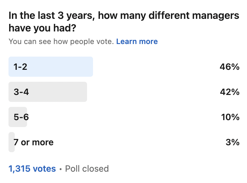
For my own curiosity I launched a poll on LinkedIn asking people how many different managers they’d had in the last 3 years. The results:

Poll results to the question, "In the last 3 years, how many different managers have you had?" 46% responded 1-2, 42% responded 3-4, 10% responded 5-6, and 3% responded 7 or more.

With a little arithmetic, you see that more than half of the respondents have a new manager at least every year, with a decent portion having 2 new managers every year.

The Management Carousel is detrimental to team member growth

A team member works with a manager on a growth plan, that manager starts them on this path, but then the team member shifts to a new manager, and that new manager is likely trying to get up-to-speed on a whole bunch of matters, so career growth stalls, and if managers keep turning over, the team member cannot advance. 

Such stalling isn’t just a problem for the team member, though. It damages the broader organization in two ways. The most obvious is, if team members aren’t growing, they’re not getting better at their job, so the work doesn’t improve.

But more crucially, when team members don’t see a growth path, they leave. A few years ago, Todd Zaki Warfel conducted research and analysis on careers in design, and found that the second most common reason for people to leave a company was “lack of career path.” 

The “lack of career path” is particularly acute in UX/Design

The Management Carousel is neither new, nor specific to UX and Design. That said, I think it’s more of a problem in these fields, because there are not broad industry standards for what it means to grow as a professional. Particularly for the early-career professional looking ahead, their potential growth paths appear to be covered in ivy and vines, and the best that most companies do is give them a machete and say, “Good luck.”

How to help people grow

The Fairy Godm—, err, Career Counselor

Abby’s comment about a “fairy godmother” may sound glib, but I think it points to a real solution. UX/Design orgs should have someone in the role of Career Counselor. This is not a manager, but someone who works across the whole organization to advocate for employees’ development, and work with team members to chart their paths. In smaller orgs, this would be a role that someone plays (probably someone in Design Operations who has more of a ‘people’ bent than a ‘programs’ bent), and then as a team scaled, it could become a dedicated position. 

Empower Employees with Robust Career Architectures

When we accept the Management Carousel as a given, it becomes clear that career development must be placed in the hands of the only constant: the employees. They require content and tools to figure out how they can grow. This doesn’t mean that managers aren’t involved, it just means that the process begins and ends with the team member.

As such, companies need to build robust and understandable career architectures that illuminate paths forward. Many teams have built career ladders or some other leveling framework, but that is only just the beginning. In work I’ve been doing over this past year, I’ve crafted more robust architectures built upon three components:

Capabilities

At the heart of professional development are the Capabilities needed to do the work:
– Craft skills
– Strategic mindset and tools
– Professional capabilities

Leveling

An org-wide Leveling Framework structures a set of expectations for experience, autonomy, and scope at each career level, and across Manager and IC tracks.

Disciplines

Within any function is a set of Disciplines that part of the organization is responsible for. For UX, that’s typically UX Design, UX Research, and Content Design.

Specific Roles are found at the intersection of Levels and Disciplines, with suitability and readiness made clear by competency in skills. 

(At some point, I’ll be publishing more of my work on such architectures. Until then, if you’re interested in learning more, I’m leading a workshop on the subject from 12-15 September 2022 for the Design Ops Summit.)

There’s a lot more to unpack from here

I’ve only scratched the surface of what I think is a crisis in management for the Design / UX field. True lasting solutions will need broad community and industry support, including real professionalization (certification, licensing, etc.) brought forth by credible professional organizations (like the Interaction Design Association or the User Experience Professionals Association) that establish an outline of what it means to advance in your career.