When a design team is small, fewer than 10 people, design quality can be successfully managed informally—reviews, crits, swivel-the-monitor discussions. The Head of Design can reasonably keep tabs on all the work, and, through discussion, drive their team toward higher quality.
As design teams grow into design orgs, this oral culture approach frays. The Head of Design can’t see all the work. Quality is determined by design managers and team leads, who may have varying opinions as to what good looks like. The larger the team gets, the more chaotic this view of quality becomes. Additionally, a larger design org is part of an even larger product development org, which ends up exponentializing the voices commenting on design quality.
With all this noise, the only way to handle design quality at scale is to establish clear frameworks, guidelines, patterns, and measures of success that can shift local discussions of design quality from personal preferences and toward organization-wide references.
What surprises me is that pretty much every design organization I engage with, regardless of size, still maintains that folkloric approach to quality. This is dangerous, because, at the end of the day, all a design org has to show for itself is the quality of the work it produces. If there are no standards, if that quality is all over the map, that reflects poorly on the design function as a whole.
The trick is, how does one define design quality? Our colleagues in software engineering have it easier—there are industry-standard criteria (reliability, efficiency, security, maintainability) with clear metrics. These criteria all pretty much hew to “how well does the code function for the needs of the machine?”
Design quality, though, is perceived in the messy context of people and business. When we say that a design is “good,” what do we mean? How do we distinguish that from “great”? How do we articulate a quality framework so that everyone on the team understands what is expected in terms of the sophistication of their work? (When I work with VPs of Design, I ask them, “How do we inform a 25-year-old junior designer in your most distant office what good looks like?”)
Over time, I’ve developed a an approach to establishing design quality within an organization. There are a slew of components:
Usability Heuristics
In 1997 I took Richard Anderson’s UC Extension class on “User-Centered Design and Usability Engineering.” (It is still the only formal training, outside of conference workshops, I’ve ever had in this field). Among the things he taught was “heuristic evaluation,” a method for assessing the usability of interfaces.
24 years later—that tool is still useful. Jakob Nielsen developed an updated presentation of the heuristics late last year. This is as close to an ‘industry standard’ as we have for a quality assessment of interfaces akin to what software engineers have developed. They’re insufficient on their own, but they are a great place to start.
Brand Personality Characteristics
Usability heuristics are table stakes. Good design goes beyond that, delivering experiences specific to the company and the context it operates within. To avoid coming across as me-too, it’s important that design embody the personality of the company brand. This isn’t just for marketing design either—it is perhaps more important in product design, as that is where the promise of the brand is actually delivered.
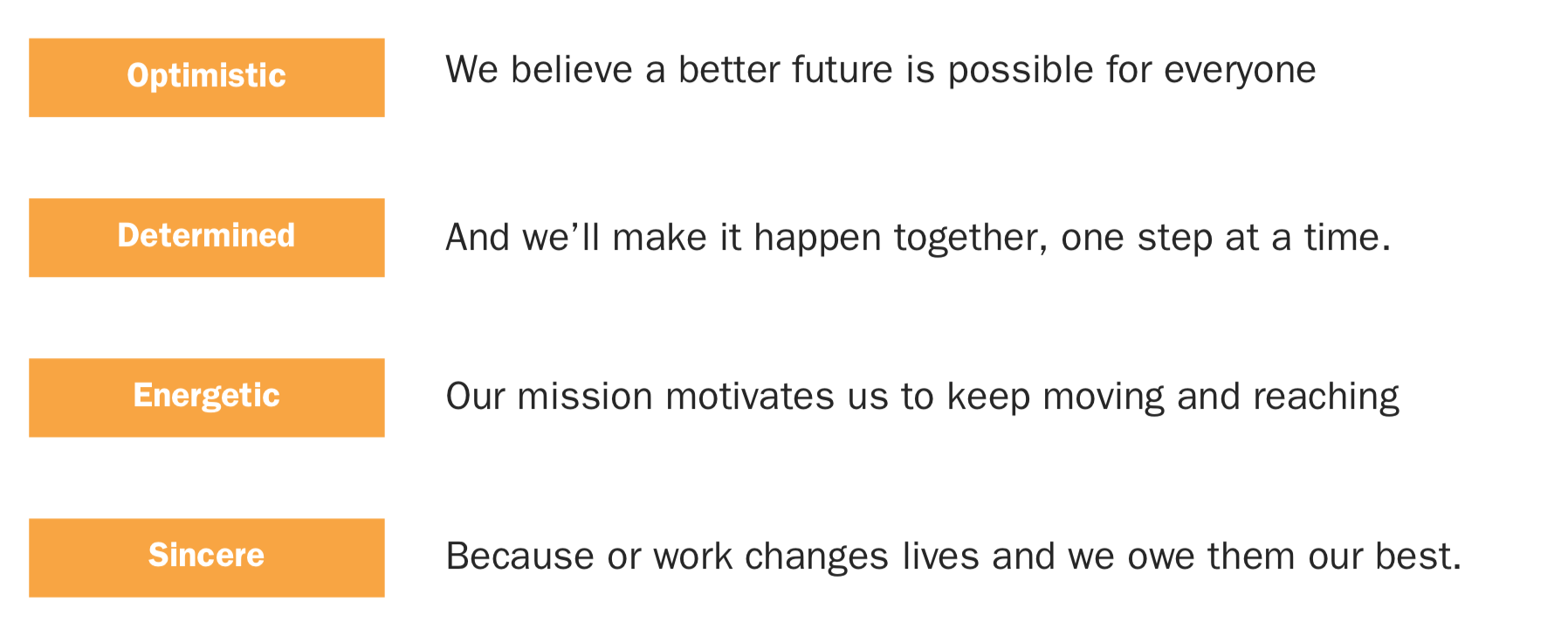
Any reasonably mature company should have a robust brand identity. This is more than a logo, typeface, and set of colors. It’s also includes a set of personality characteristics specific to the brand, traits that are important to express to help strengthen that customer connection.

Take those characteristics, and turn them into a set of “personality heuristics,” and as you develop, or review, designs, ask yourself—are we presenting ourselves in a way consistent with the personality we seek to express?
Experience Principles
Experience principles are a set of statements for how people will experience using your product. Whereas brand personality characteristics are very much inside-out (how the company wants to be perceived), good experience principles are outside-in, based in user research, and distilled insights from what qualities users seek in their experience.
Back in Ye Olden Days of UX, experience principles were all the rage. At Adaptive Path, they were a key aspect of any strategy and design work we did. From what I can tell, like other aspects of classic UX design (RIP site maps), they’ve fallen out of favor. Which is too bad—this post by Julie Zhuo makes clear how helpful they can be.
Former Adaptive Pathers Chris Risdon and Patrick Quattlebaum shared their practice in crafting principles, and here’s a website cataloging dozens of published principles. (Favorites include: Tivo’s original design principles, Microsoft Windows 7 Design Principles, Opower’s Design Principles, Asana’s Design Principles.)
As with brand traits, turn these principles into a set of heuristics, and assess your designs for how well they deliver on those heuristics.
Design Guidelines / Design Systems
Perhaps the best known way to maintain a certain level of acceptable quality at scale is to institute design guidelines, or, if you have the resources and the need, a fuller-fledged design system. These help ‘raise the floor,’ of your design, by making sure that, at least in the content and interface, there’s consistency across the entire user’s experience.
While I support the development of design systems, I’m wary of how they’ve emerged as a panacea to solve all design problems. I take issue with this because I see design as a fundamentally human endeavor. For design to thrive, it must be rooted in a healthy and humanistic context.
Design systems are about automation and, frankly, are dehumanizing. This can be okay if there’s a strong design culture in place that can wield the systems with taste and judgment. But if there isn’t, then design systems simply support the mechanization of design, reducing design practice to asset creation to feed the engineering machine.
Inclusive design and accessibility practices
Regrettably, my commentary here will be thin, as this is an area I haven’t explored in much depth. But my neglect shouldn’t be your excuse! Because when we say “quality,” there’s an implication of “quality for whom?” When we discuss Measures of Success next, we situate design quality in a business context, and, well, if a significant portion of potential users cannot engage with your design because it is ignorant of inclusive principles or accessibility guidelines, that’s bad for business, which is bad design.
Quality toolkits for inclusive design have been developed by the University of Cambridge and Microsoft.
Measures of Success
Fundamentally, the only measure of design quality that matters is how it contributes to (or detracts from) whatever has been agreed upon as a measure of success. Unlike engineering, where there are industry-wide standards for success, success for design cannot be extricated from what success looks like for the broader organization.
In my experience, the most salient measures of success for design are identical to those for product management. Key “product” metrics around acquisition, retention, satisfaction, engagement, task completion, etc., are what designers should primarily be delivering against, and are the most important markers of ‘quality.’
That said, it’s surprising how often product development work starts where the product team doesn’t have a clear understanding of success. I encourage my designers, and now the design teams I consult with, to not engage on any work until there are clear, shared measures of success. Without an understanding of what success looks like, decision-making becomes arbitrary, and designers find themselves jerked around… which inevitably leads to lower-quality work, as stuff gets shipped half-baked, it’s hard to say “No” to less important projects, people are spread too thin, etc. etc.
For more on this, I appreciate this article: Empower Product Teams with Product Outcomes, not Business Outcomes. (And just remember, design ‘outcomes’ are the same as product ones.)
Explained Exemplars of Quality Work
The next step is to take the elements discussed so far—traits, principles, guidelines, and measures—and show how they are embodied and delivered in final product. Every team should have a gallery of exemplary work, with clear explanations as to why the work can be considered, well, “good.” You can think of it as case studies, or a design team’s collective portfolio, though in this case, process is less interesting than the final product.
As we’ve discussed, whereas engineering quality is standardized and largely context-free, design quality is very much rooted in the context in which it operates. Also, design decision-making is not solely the product of a rational process. As such, there will always be subjectivity in the creation and assessment of design. By sharing exemplars in this gallery fashion, you can meld the subjective with the objective, and teach the team the language by which matters of quality can be communicated.
Oh, and if your team doesn’t have their own quality work to share (because they’re so new, or they just haven’t been able to deliver on the kind of work they feel proud of), then start your gallery with publicly available work.
Unfortunately, there aren’t many examples of “good design” galleries in the spirit of which I’m thinking. I’ve always dug Milton Glaser’s critique of Olympics logos, as it’s not just preferences, but rooted in robust design values.
Mature and inclusive critique practices
Critique is not a ‘nice-to-have’ in the design process. AsErika Hall said on an episode of Finding Our Way :
“The practice of design is creation and criticism in dialogue with one another. And I think we’ve emphasized creation and completely lost the sense of criticism, even though that’s fundamental, that’s one half of that dialectic.”
Critique is how we get to quality. We place our work up or review, we get feedback from other minds, and the refinements based on that input make it better.
A problem, often, with critique is that it can feel arbitrary and rooted in preferences. That’s why I’ve placed it last—critique should be rooted in all the elements shared before.
Even with all these elements in place, it’s crucial to attend to the practice of critique to ensure that it operates in an inclusive fashion. Braden Kowitz has written on practices that lead to improved critiques.
I reviewed a number of explanations of critique processes. Some that stood out:
Design Critiques at Figma . Super extensive, and quite apt in our everything-remote world.
How to Run a Design Critique . From our pal Scott Berkun.
Defining quality is of existential importance for design organizations
Because design teams are judged by the quality of their output, it’s essential for these teams to thoughtfully establish just what quality means in their organization. Clarity around quality empowers design teams to:
- push back on unreasonable requirements (or, if no requirements exist, insist on developing those before doing any work)
- incorporate quality determinations into the broader product development process, to discourage shipping crap
- protect team members’ time, focusing on prioritized efforts that are meaningful and likely have impact, and ignoring executive brain farts that everyone knows won’t go anywhere
- staff projects and programs appropriately to drive to those quality outcomes
- consistently deliver good work, which leads to ongoing benefits, not just with customers, but internally for morale, retention, and hiring
This post is already too long, and I feel like I’ve only scratched the surface. I’d love to hear about how you define quality for design, and what resources you’ve found valuable in that work.
 I’m thinking about this as I read Patrick Lencioni’s The Advantage, which I’m finding to be an excellent read on team building and leadership. It contains ideas from his other books, notably The Five Dysfunctions of a Team, and one of those Dysfunctions is not holding people accountable. I highlighted this passage:

